Last week Thursday I have finished all of my Maya work for week 3.
This time it was, the different type of lighting for a scene.
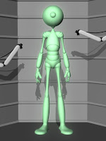
The first scene I was to set a light in the cinema.
I had to use both Maya and Photoshop for this one because for Maya I had to set up the light while in Photoshop I had to edit the picture to make it blurry.
Cinema scene layout
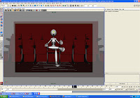
Cinema render
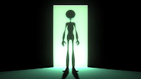
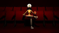
The next one was a Glow from a doorway. The only proble I came across was when I rendering the image the glow did not set right on the ground. It turns out I didn't tell the main light to bright through the plane behind the character.
Glow render
The third one was a beach sceen. I don't think I came across any problems when setting the light in this scene.
Beach render
The forth one was to set a light in a display room. Same as the last one I didn't came across any problems.
Display render

Once I have finished all the lights for diffenrt scenes. I then started then next one. Which was, different styles of light. The first one was an Early Morning style. I didn't came across any problems when I was setting the light, but this effect felt a bit dull.
Early Morning render
The next one was a Mid Morning style. Same as the last one I didn't came across and trouble when I was setting the light, but this one feels a little better then the last one.
Mid Morning render
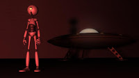
The third one was a Night effect. This lighting style was also easy to make, thats because I used a guide to help me, but still it was easy to make.
Night render

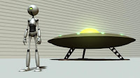
Next was a Horror lighting style. However to me this one has more of a film noir effect to it then horror.
Horror render
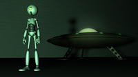
The Sci-fi style is the same as the Horror one, but a bit lighter. I think this one was ment to repersent the old Sci-fi films that were black and white.
Sci-fi render
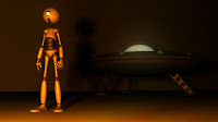
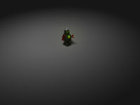
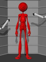
The last one is the Fire style. this one gave me a bit of problems because I had trouble choosing the colours. I chose a Red colour by mistake. What I really ment to choose was a mix betwwen red and orange, to give a more better firiy look.
Fire render
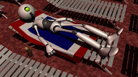
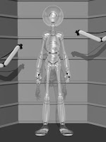
The next homework was to animate objects. the first one was to animate a robot skating across the scene. This one took a while to animate because I had to set most of his actions to rotate infinatly. However I am pleased of how the animation went.
Robot render
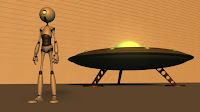
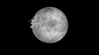
The last object I had to animate is a rocket thats following a path. The only problem I came across was saving the animation. Other than that it went well.
Rocket render


.JPG)
.JPG)
.JPG)
.JPG)
.JPG)
.JPG)


.JPG)
.JPG)
.JPG)
.JPG)

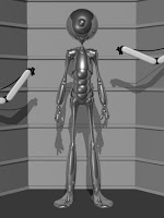
 Glass texture render
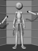

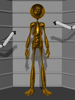 Gold Texture render
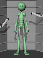


.JPG)
.JPG)
.JPG)